
Loading...

Share


 Copied
Why Color Consistency is Crucial for Strong Brand Identity
08 July, 2024

Carlos Dusan
Table of Content
- Understanding Color Psychology in Branding
- The Benefits of Consistent Brand Colors
- Ensuring Color Consistency Across Channels
- Challenges and Solutions for Consistent Color Branding
- Best Practices for Color-Consistent Branding
- Examples of Brands with Effective Color Consistency
- The Role of Color in Brand Identity and Customer Perception
- Conclusion
Subscribe to Our Newsletter
Get the latest web development tips, SEO strategies, and industry insights delivered to your inbox.You are now subscribed to our newsletter. Thank you
Did you know that using consistent brand colors can increase brand recognition by up to 80%? Color consistency is a key element of effective branding that builds trust, boosts awareness, and drives customer loyalty. So let's explore the importance of color consistency in branding and provide actionable insights to help you harness the power of color for your brand.
Understanding Color Psychology in Branding
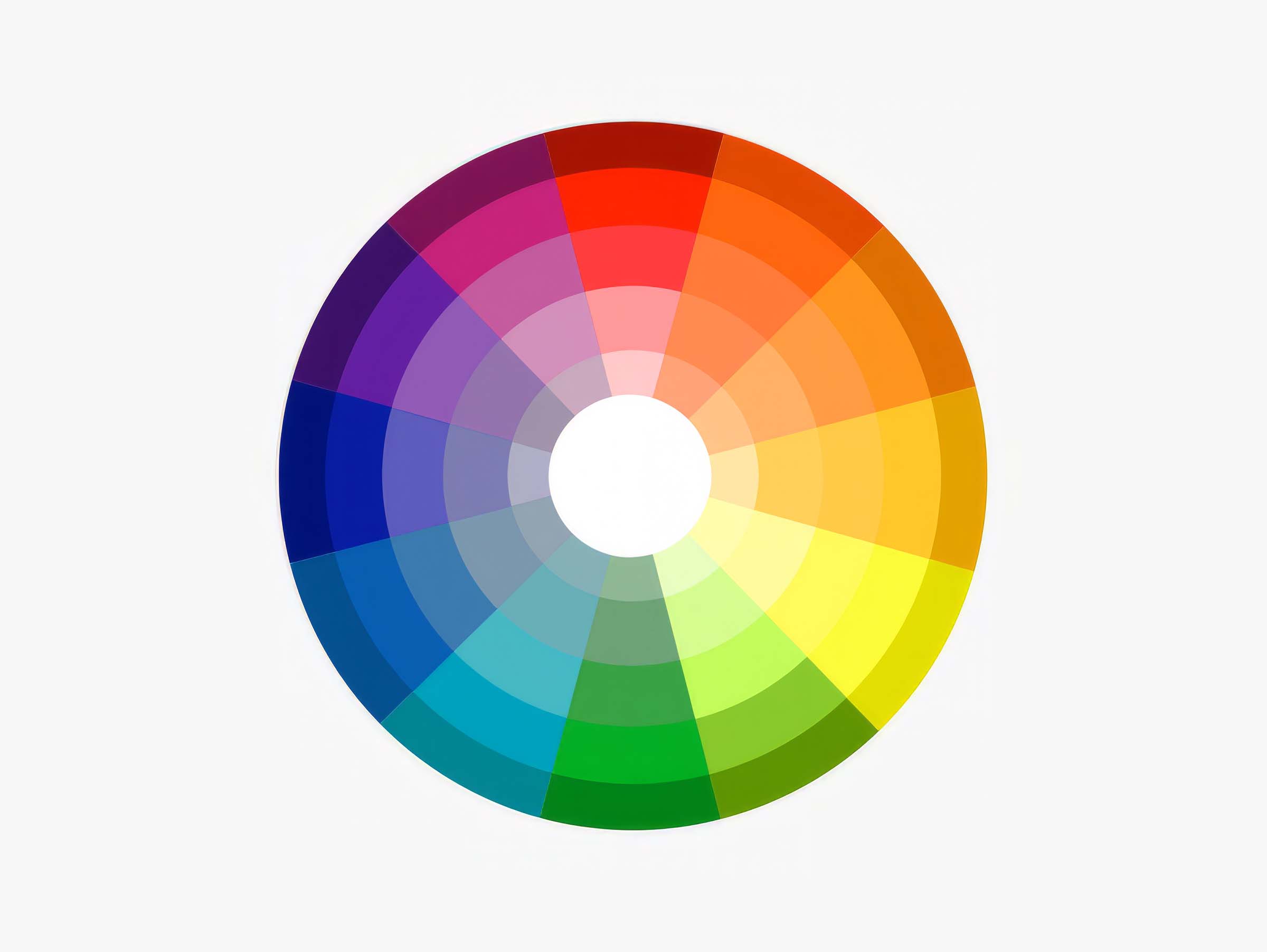
Colors evoke emotions and associations that shape how consumers perceive your brand. Here are some common color meanings:
- Blue: Trust, reliability, calm
- Red: Excitement, passion, urgency
- Green: Growth, health, nature
- Yellow: Optimism, friendliness, creativity
- Purple: Luxury, royalty, spirituality
It's important to note that cultural differences can influence color perception. For example, while white is associated with purity and innocence in Western cultures, it's often linked to mourning in Eastern cultures.
When choosing colors for your brand, consider your brand values and target audience. Create a distinct and memorable color palette that aligns with your brand personality and resonates with your customers.
The Benefits of Consistent Brand Colors
1. Enhancing Brand Recognition and Recall
Colors are easier to remember than words or logos alone. By using consistent colors across all touchpoints, you create a cohesive brand image that sticks in consumers' minds. A study by the University of Loyola found that color increases brand recognition by up to 80%.
2. Establishing Brand Trust and Credibility
Consistently presented brands appear more professional and reliable. Color consistency shows attention to detail and instills confidence in your brand. In fact, a survey by Kissmetrics revealed that 93% of consumers consider visual appearance to be the key deciding factor in a purchasing decision.
3. Differentiating from Competitors
Owning a distinct color scheme sets your brand apart in crowded markets. Color is a key aspect of unique brand identity and positioning. For example, Tiffany & Co.'s iconic "Tiffany Blue" has become synonymous with luxury and exclusivity.
Ensuring Color Consistency Across Channels
To maintain a cohesive brand image, it's crucial to ensure color consistency across all channels, both digital and print. Here's how:
1. Defining Brand Color Guidelines
Create a comprehensive brand style guide that specifies exact color values using industry-standard color systems:
| Color System | Example |
| Pantone | PMS 286 C |
| CMYK | C:100 M:60 Y:0 K:6 |
| RGB | R:0 G:93 B:170 |
| HEX | #005DAA |
Include examples of proper color usage and application to ensure consistency across all marketing materials.
2. Implementing Color Standards in Digital Media
Ensure consistent colors in logos, websites, apps, social media, and emails. Optimize color display across various screen sizes and devices to maintain visual integrity.
3. Maintaining Color Consistency in Print Materials
Use Pantone color matching for accurate printing and monitor color consistency across print runs and vendors. Regularly communicate with your printing partners to ensure adherence to your brand color guidelines.
Challenges and Solutions for Consistent Color Branding
1. Accommodating Color Variations in Different Media
Different color systems are used for print (CMYK) and digital (RGB) media. To ensure consistency, work with skilled designers who can adjust colors for optimal display on various substrates and materials.
2. Ensuring Color Accuracy with Partners and Suppliers
Clearly communicate your color specifications to all partners and suppliers. Request proofs and samples to verify color matching before finalizing any branded materials.
3. Updating Color Palettes for Rebrands or Refreshes
When evolving your brand, strategically choose new colors that align with your updated brand identity. Implement color changes systematically across all brand assets to maintain consistency.
Best Practices for Color-Consistent Branding
- Conduct a color audit of existing brand assets to identify inconsistencies
- Create a "single source of truth" brand style guide that includes color specifications
- Appoint brand stewards to oversee color consistency across all touchpoints
- Invest in color management technology and tools to streamline color accuracy
- Prioritize color consistency in quality assurance and approval processes
Examples of Brands with Effective Color Consistency
1. Coca-Cola
Coca-Cola's iconic red and white color scheme is instantly recognizable worldwide. The brand consistently uses this color combination across all touchpoints, from packaging and advertising to merchandising and events. This unwavering commitment to color consistency has made Coca-Cola one of the most recognizable brands in the world.
2. McDonald's
The golden arches and vibrant red background of McDonald's logo are synonymous with fast food. The company ensures that these colors are consistently reproduced across all restaurants, packaging, and marketing materials. This color consistency has helped McDonald's establish a strong brand identity and global presence.
3. UPS
UPS's distinct brown color, often referred to as "UPS Brown," is a core element of the brand's identity. The company uses this color consistently on its delivery trucks, uniforms, and packaging. The consistent use of brown has made UPS one of the most recognizable logistics brands worldwide.
The Role of Color in Brand Identity and Customer Perception
Color plays a crucial role in shaping brand identity and influencing customer perception. Color psychology in marketing suggests that colors can evoke specific emotions and associations that impact consumer behavior.
For example, red is often associated with excitement and urgency, making it a popular choice for call-to-action buttons and sale promotions. Blue, on the other hand, is perceived as trustworthy and reliable, making it a common choice for financial institutions and healthcare brands.
A study by the University of Winnipeg found that up to 90% of snap judgments made about products can be based on color alone. This highlights the significant effects of color on consumer behavior and the importance of strategic color choices in branding.
Conclusion
Color consistency is a vital aspect of building a strong, recognizable brand identity. By understanding color psychology, creating a distinct color palette, and ensuring consistency across all touchpoints, brands can harness the power of color to build trust, boost awareness, and drive customer loyalty.
Remember, color consistency in branding is not just about aesthetics; it's a strategic tool that can significantly impact your brand's success. By prioritizing color consistency and understanding the role of colors in brand design, you can create a memorable, impactful brand that resonates with your target audience.



© Search Boss, All right reserved.