


Share


 Copied
Essential Tips for Crafting a Landing Page that Converts
11 October, 2024

Carlos Dusan
Subscribe to Our Newsletter
Get the latest web development tips, SEO strategies, and industry insights delivered to your inbox.You are now subscribed to our newsletter. Thank you
Understanding Landing Pages: What Makes Them Unique?
Landing pages are dedicated web pages with a singular focus: to convert visitors by prompting one specific action, whether it’s making a purchase, signing up for a service, or downloading an asset. Unlike a typical webpage, which may contain multiple calls to action (CTAs) and extensive navigation, a landing page features one clear CTA. These pages are often crafted as part of specific marketing campaigns, guiding users directly from an ad or a link to an environment that minimizes distraction and maximizes conversion.
Why Landing Pages Are More Effective than Front Pages
While a front page introduces users to a brand’s offerings, a landing page narrows the focus to a specific action. Standard front pages include navigational links, product overviews, brand storytelling, and more, enabling exploration but potentially distracting from immediate conversions. In contrast, a landing page removes all extraneous elements, with only one central CTA aimed at conversion. This single-goal design is particularly effective for campaign-driven traffic, as users landing here are likely responding to targeted ads, indicating genuine interest in the product or service being promoted.
Essential Best Practices for High-Performing Landing Pages
For a landing page to truly excel, it must balance clear messaging with streamlined design. Every component of a landing page should work towards driving conversions by creating a user-friendly experience that minimizes decision-making effort.
Crafting Concise, Focused Messaging
- Clear Headline: The headline on a landing page should immediately convey what action you want the visitor to take. It’s essential to be straightforward and highlight the value or benefit users will gain.
- Supporting Copy: Supplement the headline with concise subtext, expanding briefly on what visitors can achieve by completing the CTA. Avoid lengthy descriptions; instead, get straight to the point to maintain clarity and engagement.
- Minimal Distractions: Refrain from including secondary links, pop-ups, or navigational elements. Fewer options mean fewer chances for visitors to leave the page without converting.
Simplified Visual Design
Landing page design should enhance the CTA without overshadowing it. A few best practices for visual design include:
- Neutral Backgrounds: Keep the background simple and avoid patterns or animations that could detract from the CTA. Clean, minimalistic layouts tend to perform best.
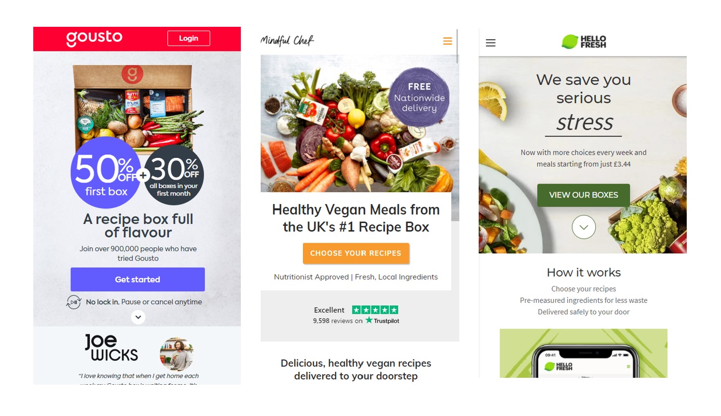
- Contrasting CTA Button: Make sure the CTA button stands out. Use a color that contrasts with the background and catches the eye, making it obvious where visitors should click.
- Consistent Branding: While branding is essential, avoid overly complex elements. A few consistent branding cues are effective, but excessive visuals or personality quirks can distract from the CTA.
CTA Optimization
The CTA button is the centerpiece of a landing page. It’s crucial to make the action both appealing and intuitive:
- Button Text: Use precise, action-oriented language on your button. For example, instead of "Learn More," opt for phrases like "Book a Demo" or "Get Started." This makes the action and next steps unmistakably clear.
- Positioning: Place the CTA button in a prominent location that’s immediately visible upon landing on the page. Often, it’s beneficial to place it both above the fold and again towards the bottom of the page for longer landing pages.
- Input Fields: If the CTA involves data collection, such as signing up for a newsletter, keep the fields minimal. Ask only for essential information, as too many fields can lower conversion rates.
Key Differences Between Landing Pages and Front Pages
Purpose-Driven Content
Landing pages are strictly conversion-focused, aligning every element to encourage a singular action. In contrast, front pages serve broader objectives, showcasing the brand and directing visitors to various parts of the site, such as blogs, product pages, or support resources.
Navigation Structure
On a front page, navigation is a key feature, guiding users through the site and allowing them to explore diverse content. A landing page, however, lacks a traditional navigation bar, reducing options to maintain focus on the primary CTA.
Design Complexity
Front pages often include diverse visuals, animations, or interactive features to enhance brand appeal. Landing pages, on the other hand, are designed with simplicity in mind, ensuring the CTA remains the focal point without competing elements.
Frequently Asked Questions (FAQs)
Why is a single CTA more effective on a landing page?
A single CTA reduces decision fatigue for visitors, guiding them toward the intended action without competing options. This streamlined approach increases the likelihood of conversions by focusing attention solely on the goal.
What should be included in the header of a landing page?
The header should contain a clear, value-driven headline that encourages the primary action. A brief supporting statement can further clarify the benefits, but the overall message should be direct and concise.
How can I improve the design of my landing page CTA button?
Use contrasting colors for visibility, action-oriented text to clarify the next step, and position it prominently on the page. Ensuring the CTA button is easy to find and understand encourages more clicks and higher conversion rates.